


Project
Project
Custom Apps for SharePoint
Custom Apps for SharePoint
Wireframe and prototype to the rescue
Wireframe and prototype to the rescue
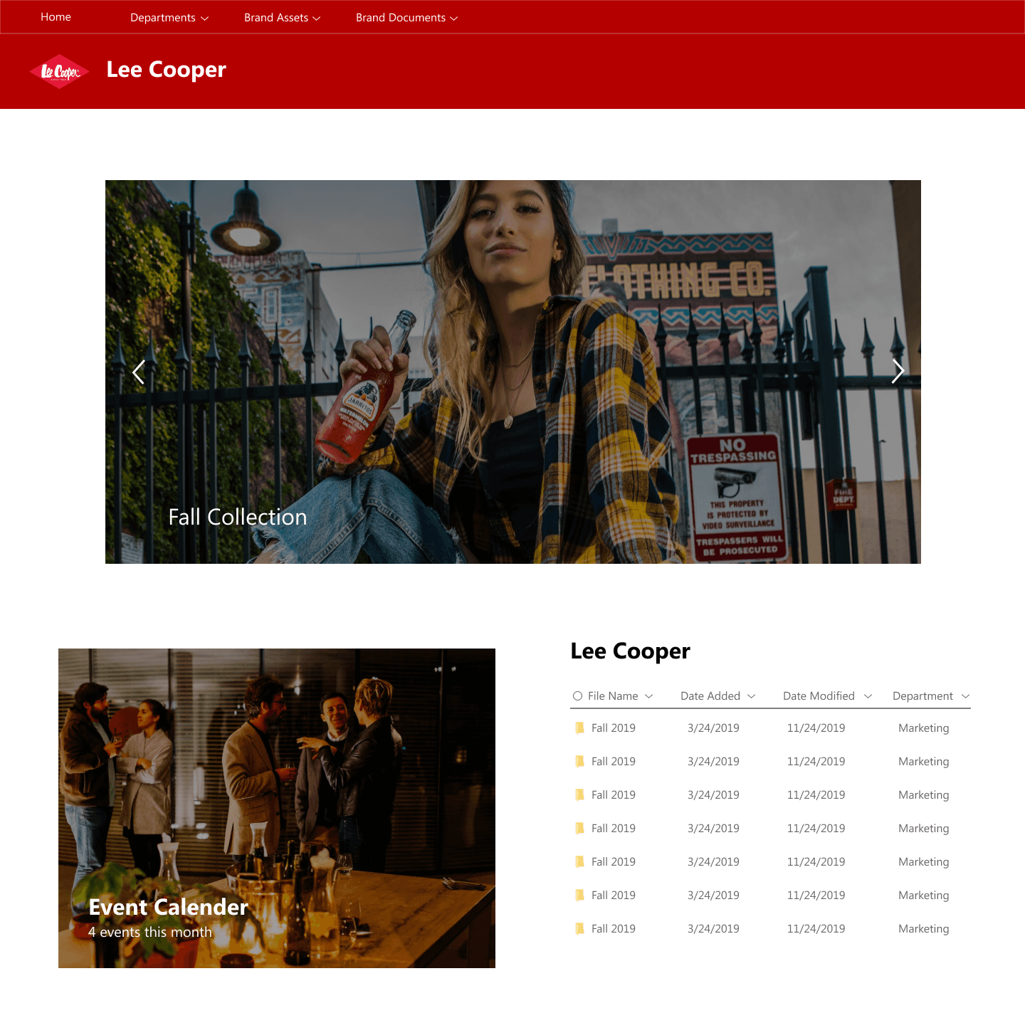
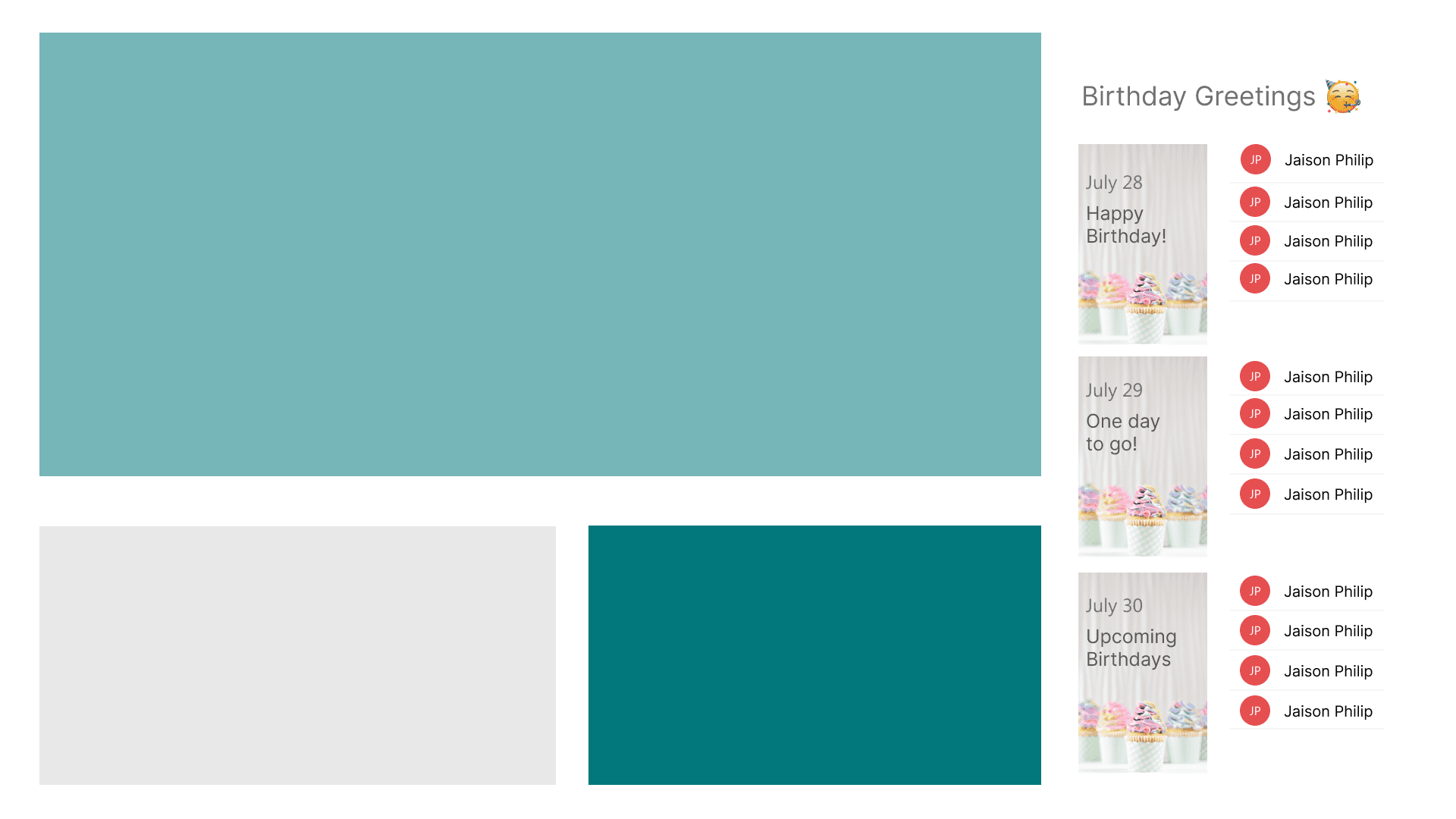
Wireframes
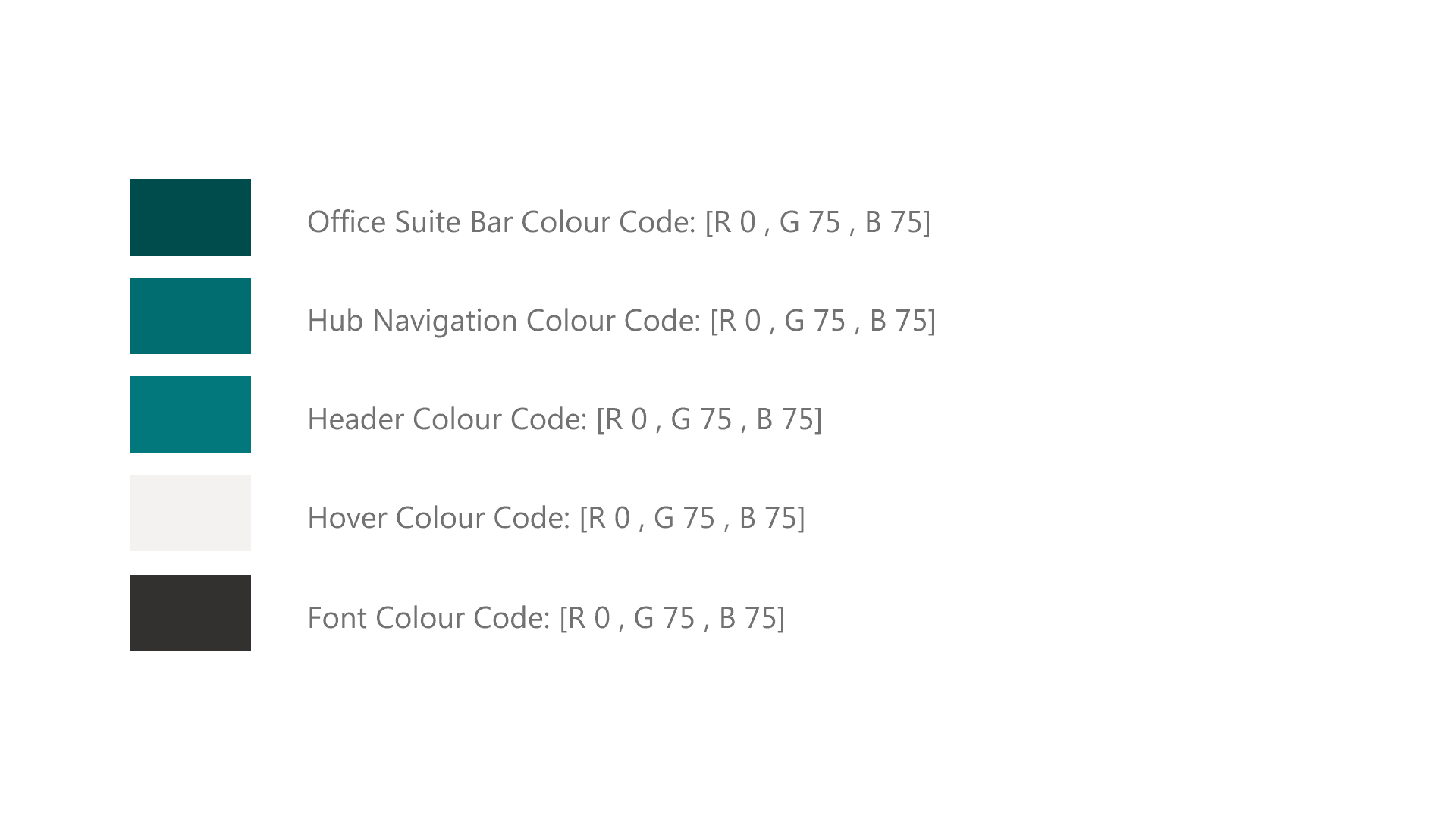
UI Colors
User experience first
User experience first
Requirement
Requirement
Clients
Clients
Migration to SharePoint Online (complete shift from existing DAM system to the new SharePoint Online environment)
Migration to SharePoint Online (complete shift from existing DAM system to the new SharePoint Online environment)
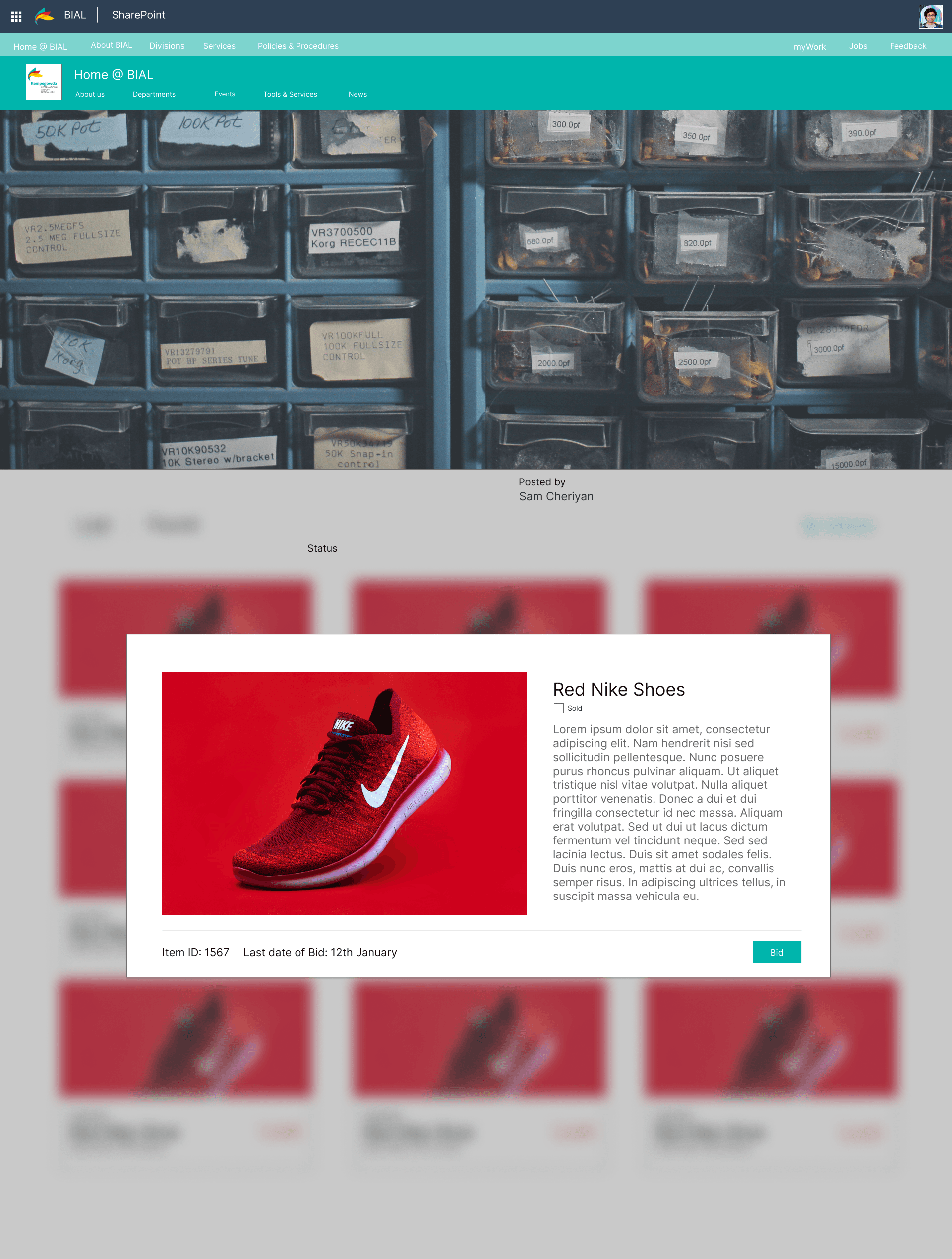
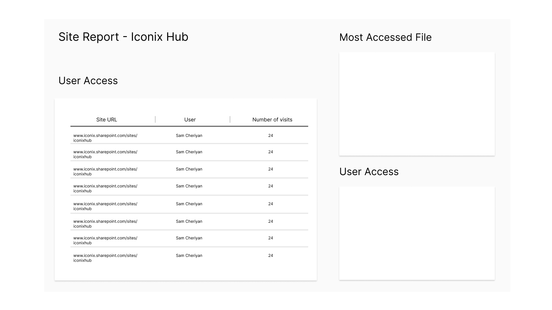
Designed and managed a team of engineers and developers to build custom SharePoint apps which took care of processes such as internal job boards and buy & sell within BIAL, Site user traffic and attendance for ICONIX and it's partner brands such as Lee Cooper, Umbro, Buffalo and more.
Designed and managed a team of engineers and developers to build custom SharePoint apps which took care of processes such as internal job boards and buy & sell within BIAL, Site user traffic and attendance for ICONIX and it's partner brands such as Lee Cooper, Umbro, Buffalo and more.
Our clients were doubtful of certain design decisions. Now this being a redesign, the team understood where they were coming from. They prioritised familiarity above all else to ensure existing users could be onboarded much easier. This is where I was able to convince them of the changes we made with the help of wireframes and prototypes.
It really helps put things in perspective when visually they were able to see the impact our design changes would bring in terms of user experience and visually how it would bring a more fresh take of the existing platform. The examples below show how the custom apps we developed would integrate with the new design and how the experience would be seamless.
Created user stories to gather clarity on user interactions for different elements within the SharePoint environment and how that can vary with permissions, from standard users to brand and site owners. This really helped the team gather how the user journey would be.
Creating different personas, such as the site owner, site member and site visitor help us distinguish the difference in what the user would see, the commands/features they would need and how they would interact with the platform as a whole. While creating user personas we not only consider their level of clearance but also their age demographic, as this was a critical consideration the team found while conducting our preliminary research about the organisation.
Conducted user testing to understand which elements were required and which elements could be removed. The personas we created really came in handy when creating test sites. How users of varying positions and age groups were able to seamlessly use the platform was tested thoroughly to ensure a clean and inclusive user experience.
Designed and developed sites and sub-sites within BIAL and ICONIX to adhere to the new look and feel of SharePoint Online, while also retaining the familiar flow and experience for end users.
Designed and developed sites and sub-sites within BIAL and ICONIX to adhere to the new look and feel of SharePoint Online, while also retaining the familiar flow and experience for end users.
BIAL (Bangalore International Airport Limited) & ICONIX Brands
BIAL (Bangalore International Airport Limited) & ICONIX Brands
SharePoint
SharePoint
